Redesigning the amount entry to reduce friction and improve completion rates across platforms.
Role
Lead Designer
Timeline
2024-2025
Team
PM, Eng, UXR, UXC
Tools
Figma, Miro
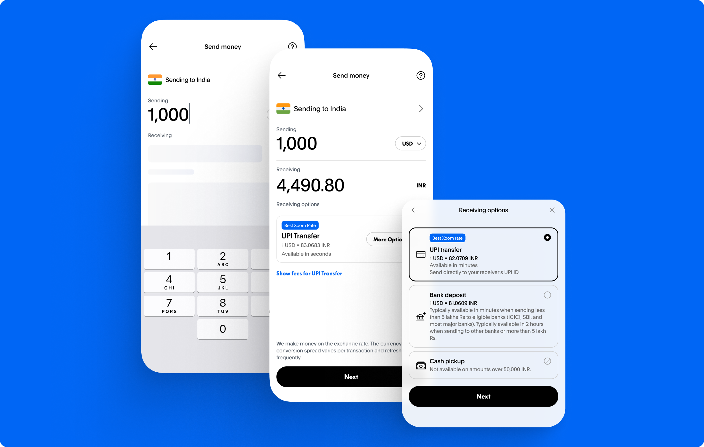
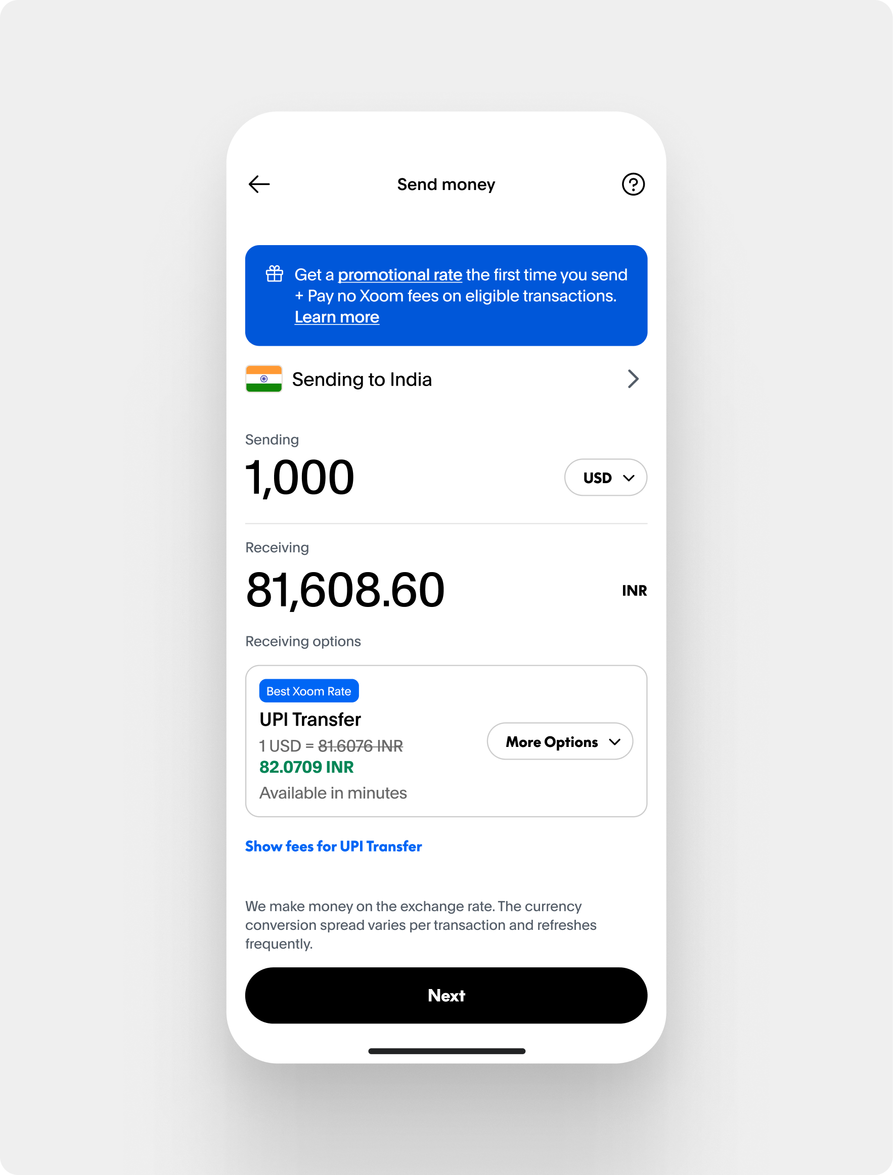
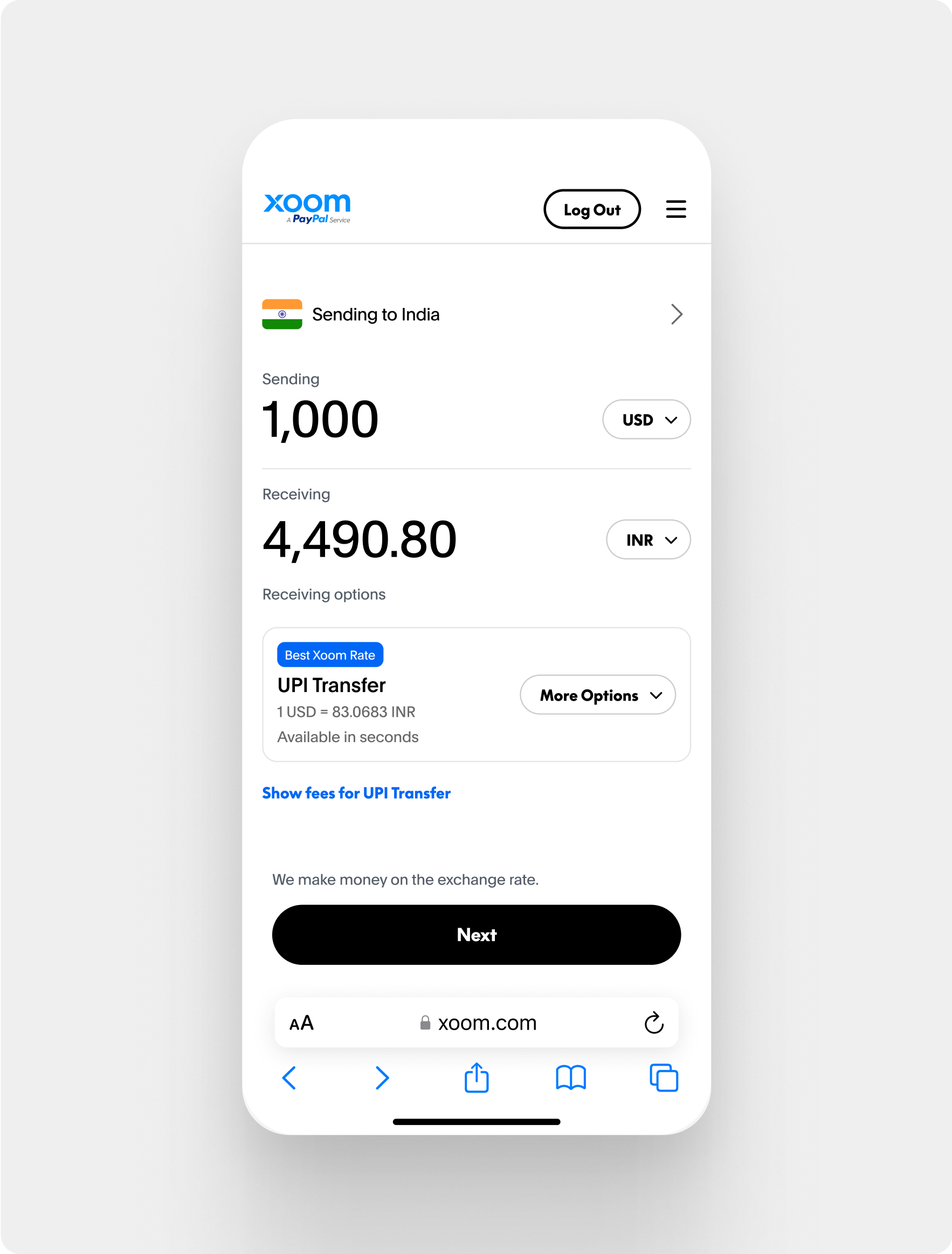
Send amount flow
Overview
At Xoom, I led the redesign of the money transfer experience for mobile and web platforms. Users struggled
to understand service differences, impacting conversion and trust. Our goal was to present key information:
fees, FX rates, delivery speeds, clearly and intuitively.
The challenge included a legacy tech stack that required building a new pricing tool, while also navigating
legal and compliance constraints. I conducted competitive research, identifying that users wanted all
options visible. I created wireframes and refined CTAs in collaboration with content design, resulting in
improved interaction quality.
Problem
Users struggled to compare services without logging in, leading to confusion and lower trust.
Hard to compare available options to send money and best FX rates.
Inconsistent formatting and error handling.
Goals
Make money transfers clearer by showing fees, delivery methods, and FX rates upfront so users can make
confident choices.
Support different funding and payout options without complicating the process.
Enhance trust by providing clear comparisons and removing hidden defaults.
Process
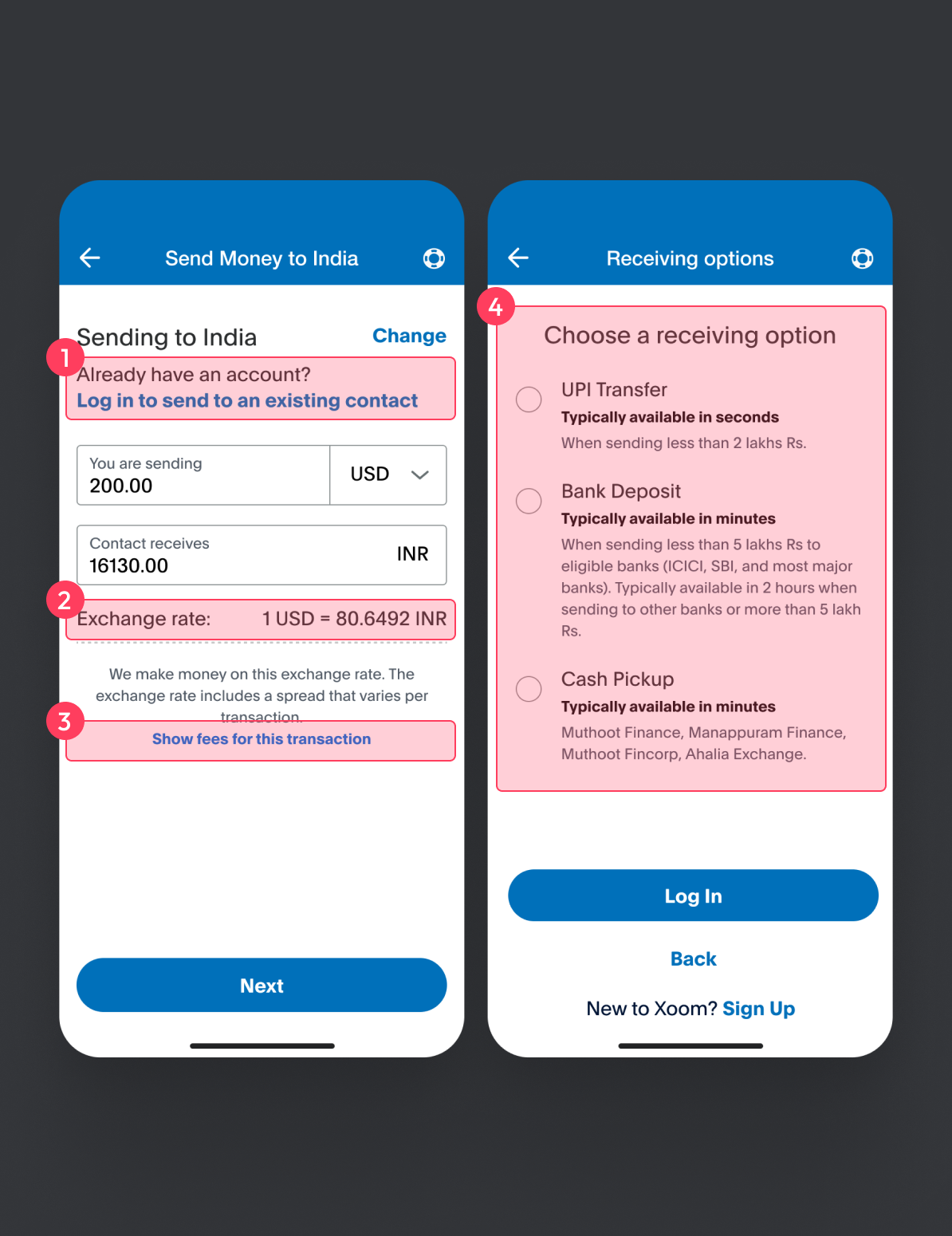
Research & Insights
To understand how users evaluate transfer services, I conducted a competitive analysis
for both direct and indirect competitors. Clear language and surfacing the right info upfront helped users
compare confidently.
Non-essential tasks prioritized at the top.
Static exchange rate.
Disconnected important information.
Missing FX rate and ETA.
Annotated issues in old flow
Exploration & Patterns
Early wireframes aligned the team. We tested layouts for unauthenticated users and refined CTAs with Content
Design
when users overlooked important actions.
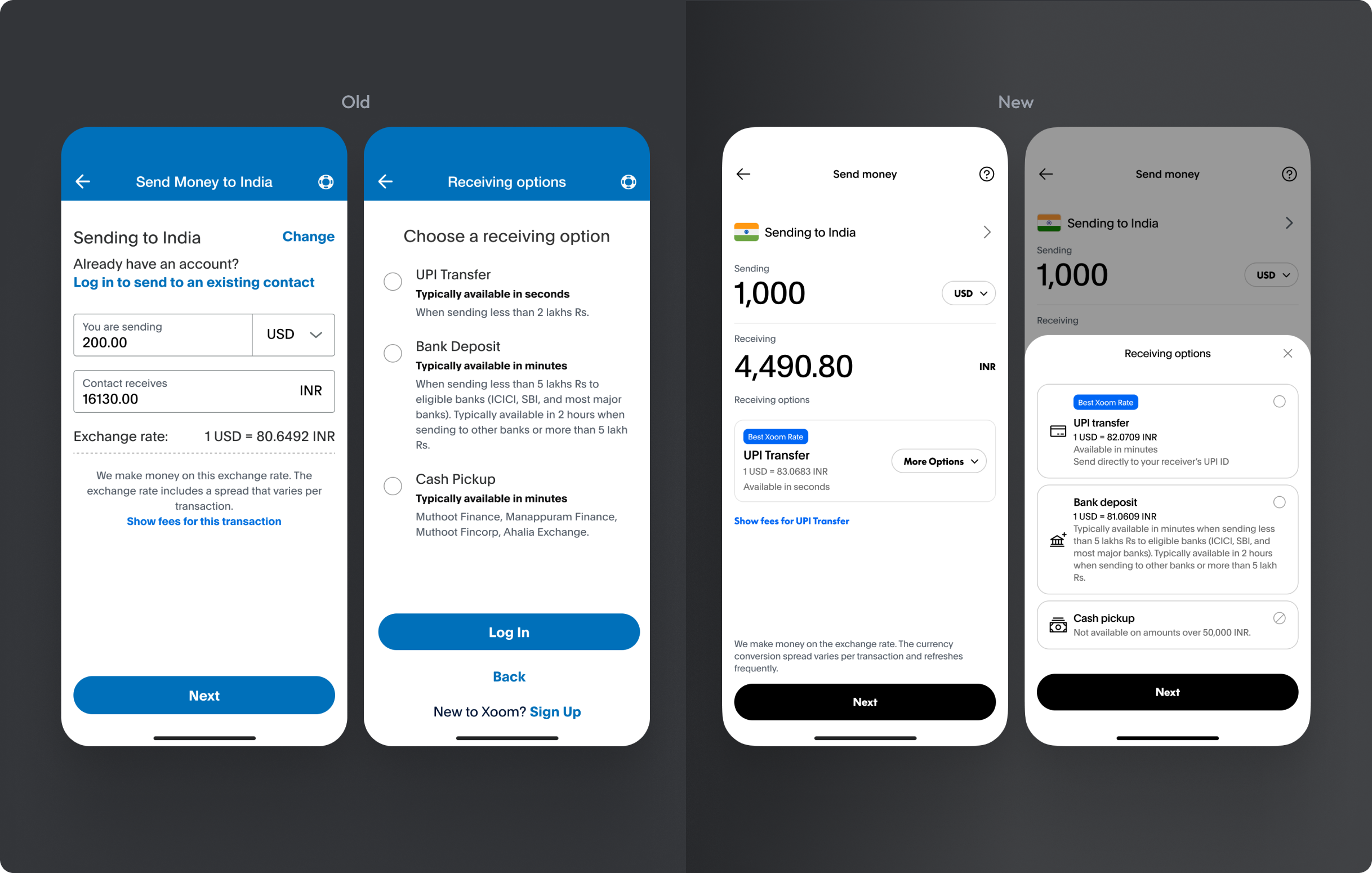
Final redesigned amount experienceFinal redesigned amount experience
Outcomes
+5%
Increase in new user conversion
+1%
Increase in repeat-user conversion
$1.8M
Estimated incremental revenue
We launched a clear, simplified experience that helped users compare transfer options before logging in.
Shipped across web & mobile; documented states in the design system and paired with engineering for
a11y-compliant
masking.