Xoom brand refresh: Aligning with PayPal’s design system
I led a redesign of the Xoom app and website to align with PayPal's new branding, creating a cleaner and more
trustworthy experience for users.
Role
Lead Designer
Timeline
2024-2025
Team
PM, Eng, UXC, legal
Tools
Figma, FigJam, Miro
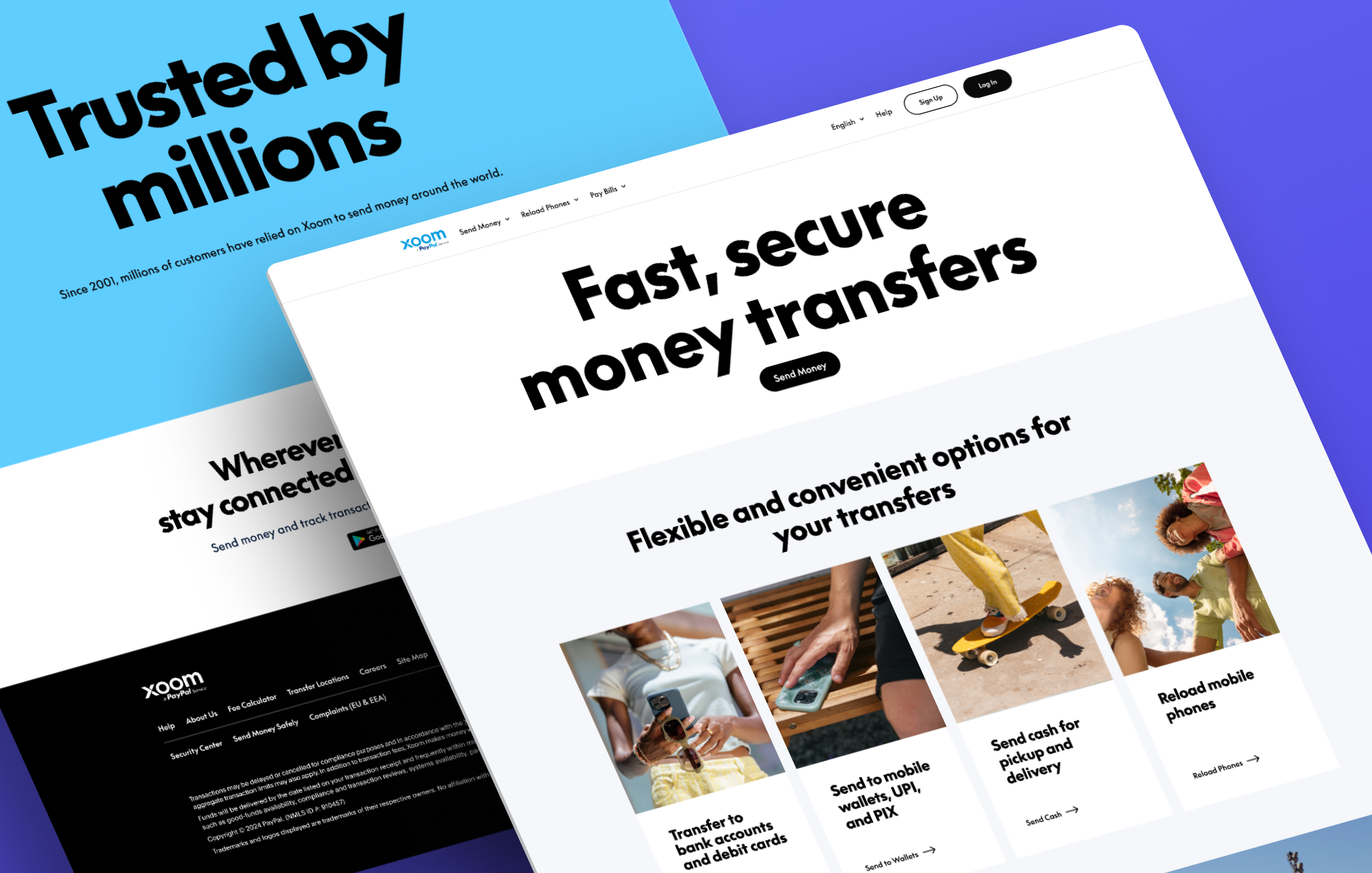
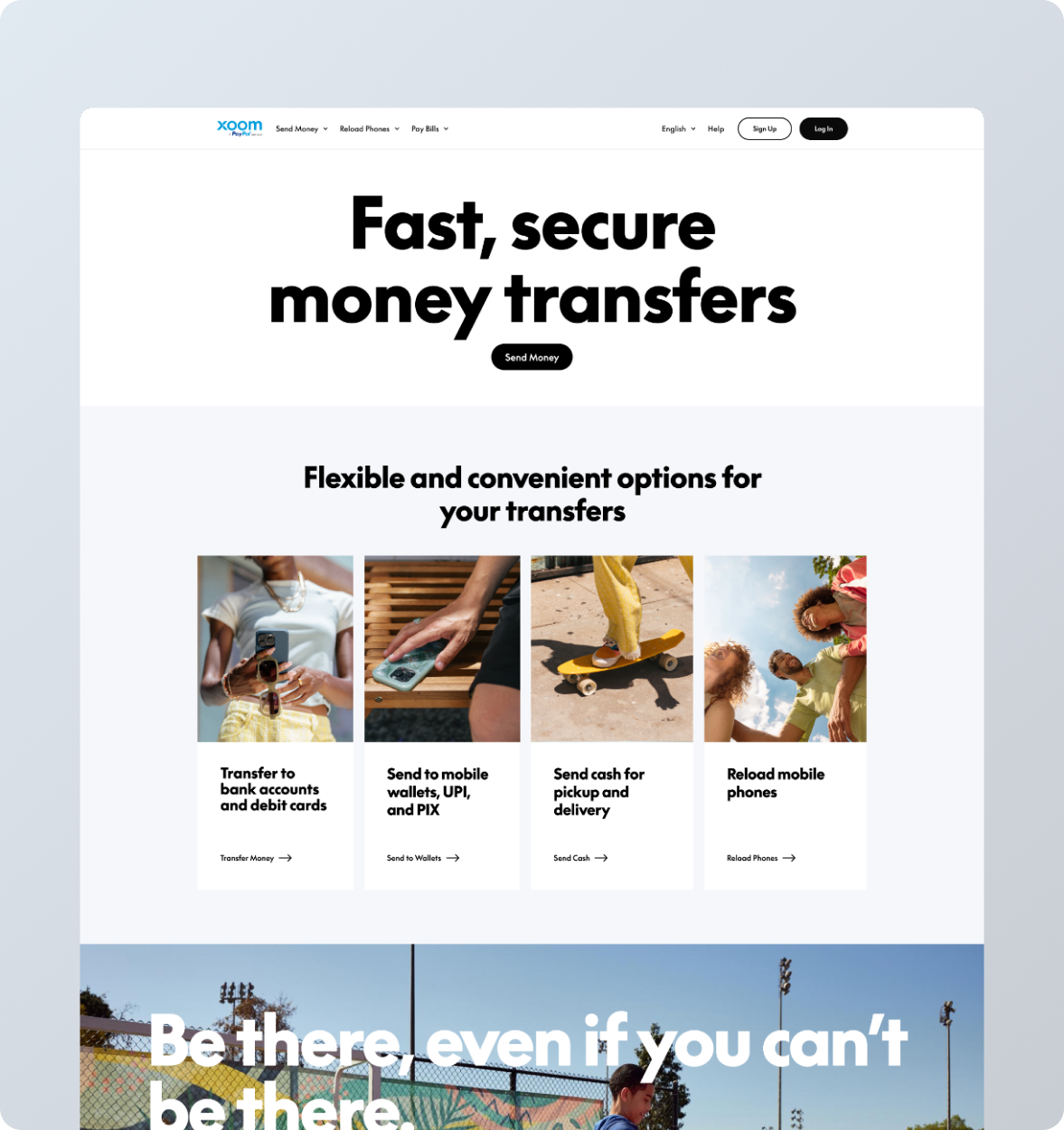
New global home
Overview
As the sole designer, I led a complete visual overhaul of Xoom's product suite, aligning its web and mobile
experiences with PayPal's new design system and brand guidelines. Over time, Xoom's user interface had become
inconsistent, featuring mismatched components and outdated patterns that affected user trust and internal
efficiency. I conducted a thorough audit of every screen, identified elements that were misaligned, and redesigned
all core flows, sending, reloading, tracking, and settings, using updated PayPal system components while
maintaining Xoom's unique functionality.
This cross-platform refresh encompassed not just the product user interface but also marketing pages and store
assets, ensuring visual and user experience consistency across all touch-points. I collaborated closely with
engineers, project managers, and PayPal's design systems team to deliver a scalable, accessible, and modern
experience without disrupting existing functionality.
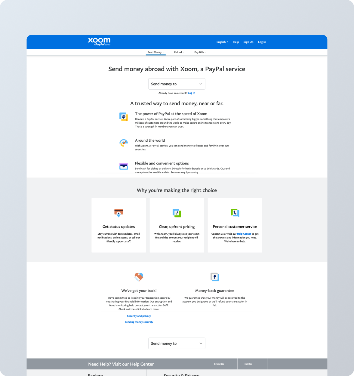
Problem
User interface combines old and new styles.
Design differences across web, and mobile app reduce usability and trust.
Xoom’s look doesn’t match PayPal’s updated branding, weakening its presence.
Outdated patterns increase development work and slow growth.
Goals
Improve visual and UX consistency across the product.
Build user trust by aligning with PayPal’s rebranded identity.
Create a modern, cohesive interface to enhance brand trust and align with PayPal's standards.
Enable long-term design system scalability.
Process
Research & Insights
While this wasn’t a traditional "blue sky" project, thoughtful planning was crucial. I began by:
Auditing every screen to categorize components by age and style.
Identifying gaps where the PayPal design system didn’t fully support Xoom’s unique use cases.
Proposing consistent alternatives that preserved both functionality and brand integrity.
Key Trade-off:
In some cases, the PayPal system didn’t account for certain patterns used in Xoom. I worked closely with
engineers and PMs to find acceptable workarounds that didn’t compromise the user experience.
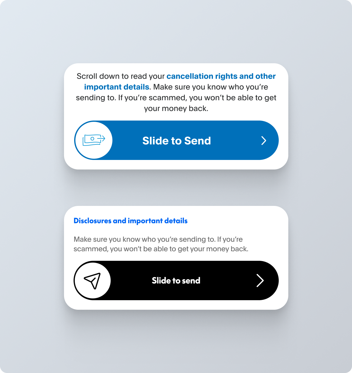
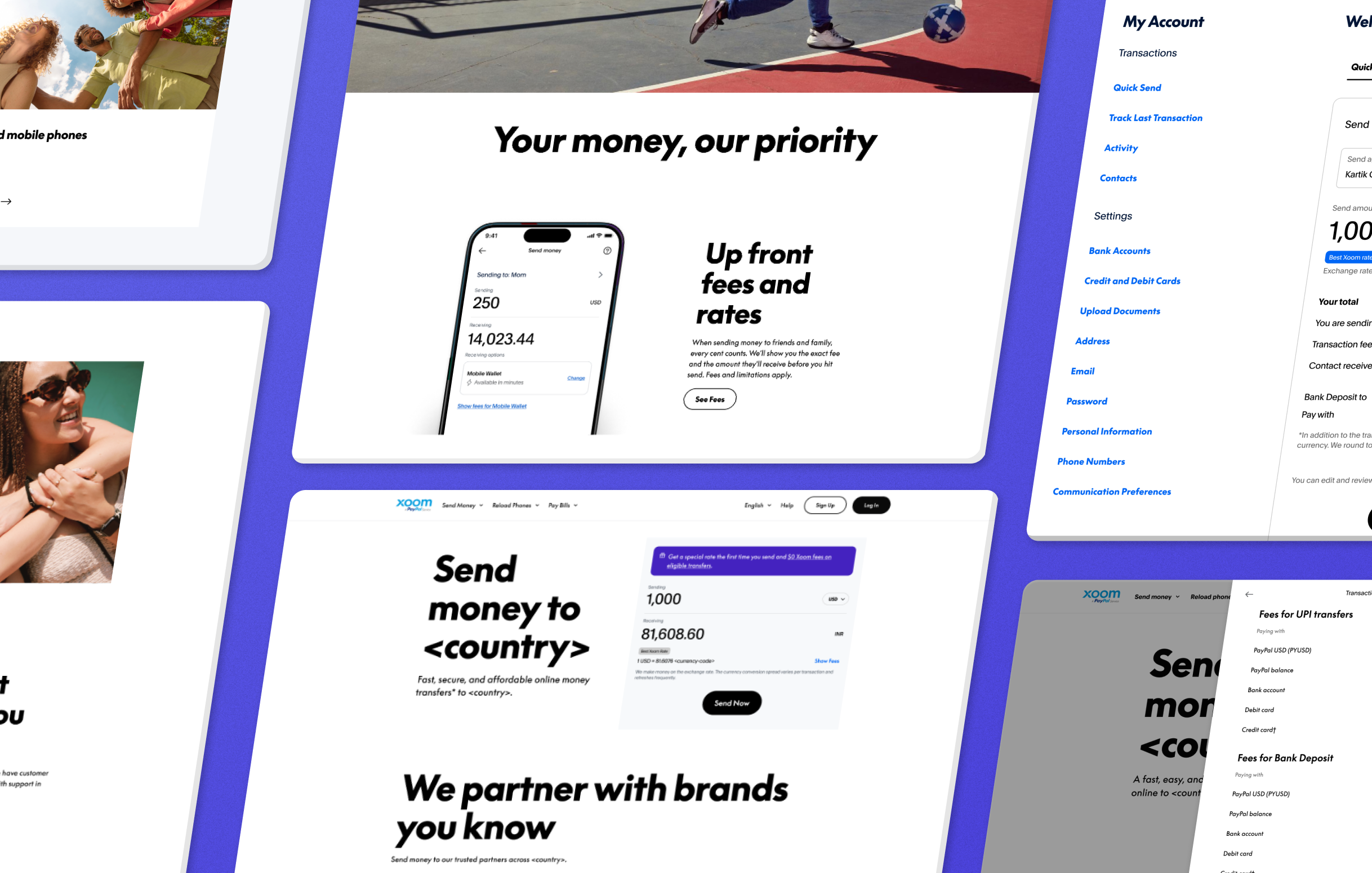
Old vs new slide to sendComponents and patterns
Exploration & Patterns
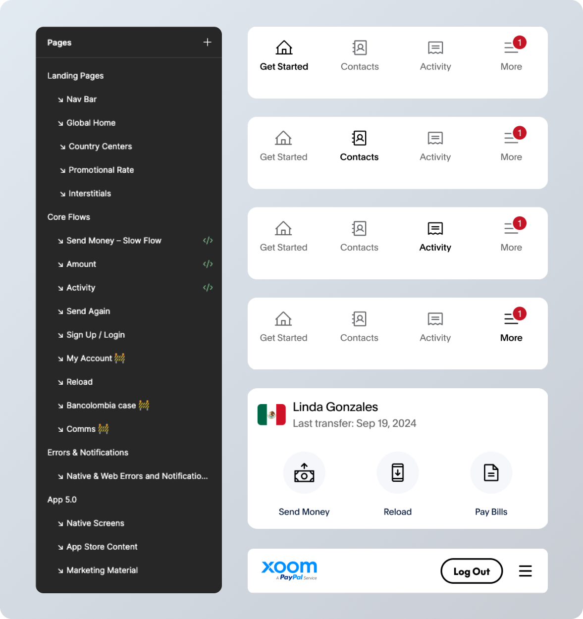
Scope of Work:
Updated all user flows (send, reload, track, activity, settings, get started).
Aligned marketing pages and mobile store assets.
Ensured accessibility, localization, and responsiveness.
Maintained parity across platforms (Mobile App, Web)
Collaboration was constant: weekly syncs with PMs and engineers kept the work moving, while regular reviews
with the PayPal Design System and Web teams ensured alignment across platforms. We validated every change
through analytics and visual QA, making sure the new experience felt consistent, accessible, and
friction-free.
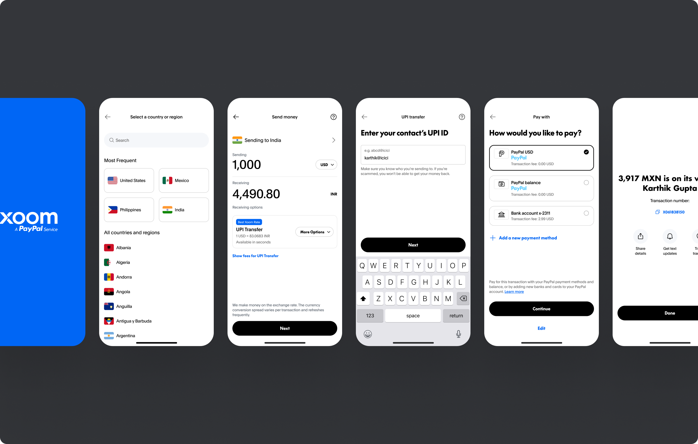
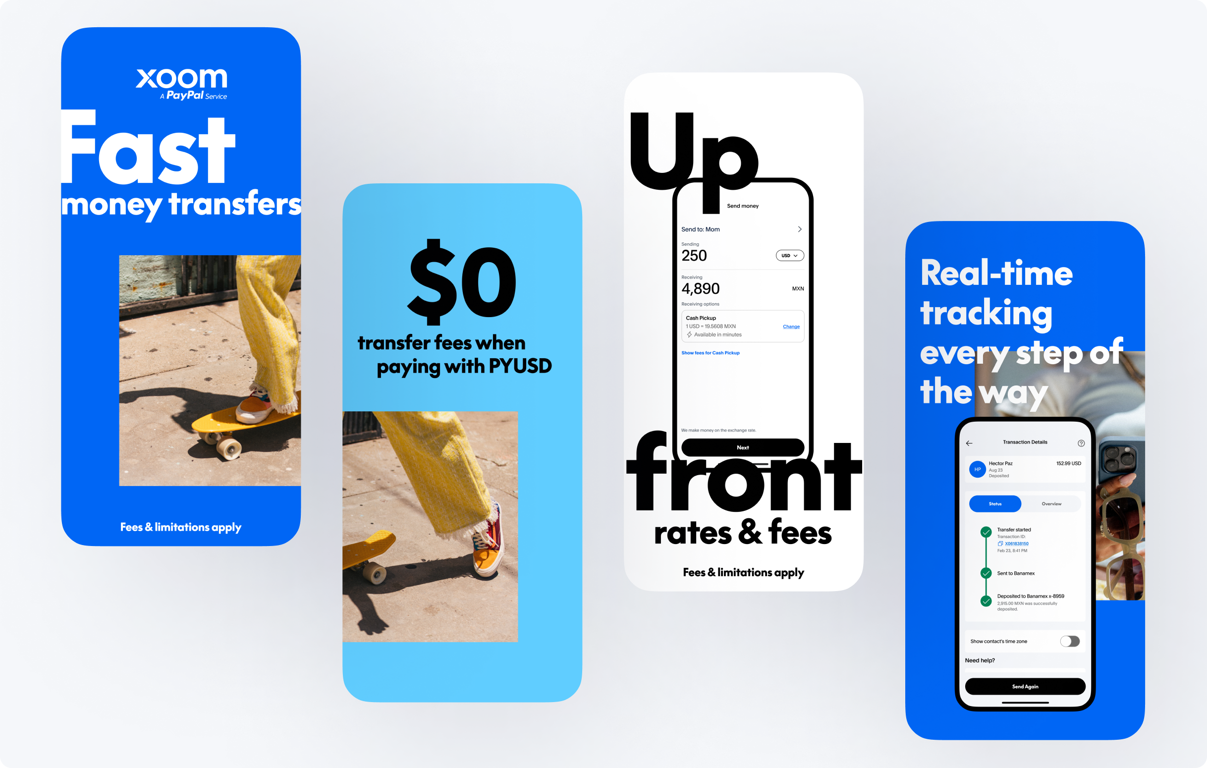
New send money flow, mobile app
Outcomes
We delivered a complete visual refresh of Xoom across web, iOS, and Android, fully aligned with PayPal’s new design
system and brand identity. I balanced modernization with reliability, ensuring every update
maintained UX consistency while breathing new life into the interface.
The reaction was immediate. Customers praised the cleaner, more modern look, while internal teams recognized the
update as a pivotal step in strengthening brand trust and unifying the product family. Early results pointed to
higher user satisfaction and a more cohesive brand presence, laying the foundation for long-term impact.