When people send money internationally, knowing exactly where their transfer stands is critical. As Lead UX
Designer, I led the design of a unified Activities & Tracking experience that brought Xoom transactions into
PayPal’s Activity view for the first time.
Before this work, customers had no way to track or manage their Xoom transfers inside PayPal, causing
confusion, uncertainty, and over 1000k monthly support calls. My role was to create a seamless,
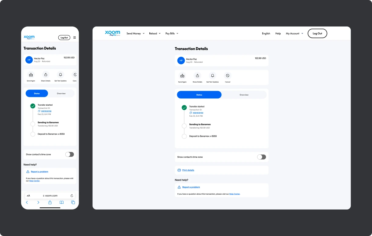
trustworthy, and transparent solution that worked across mobile, web, and both brands’ ecosystems.
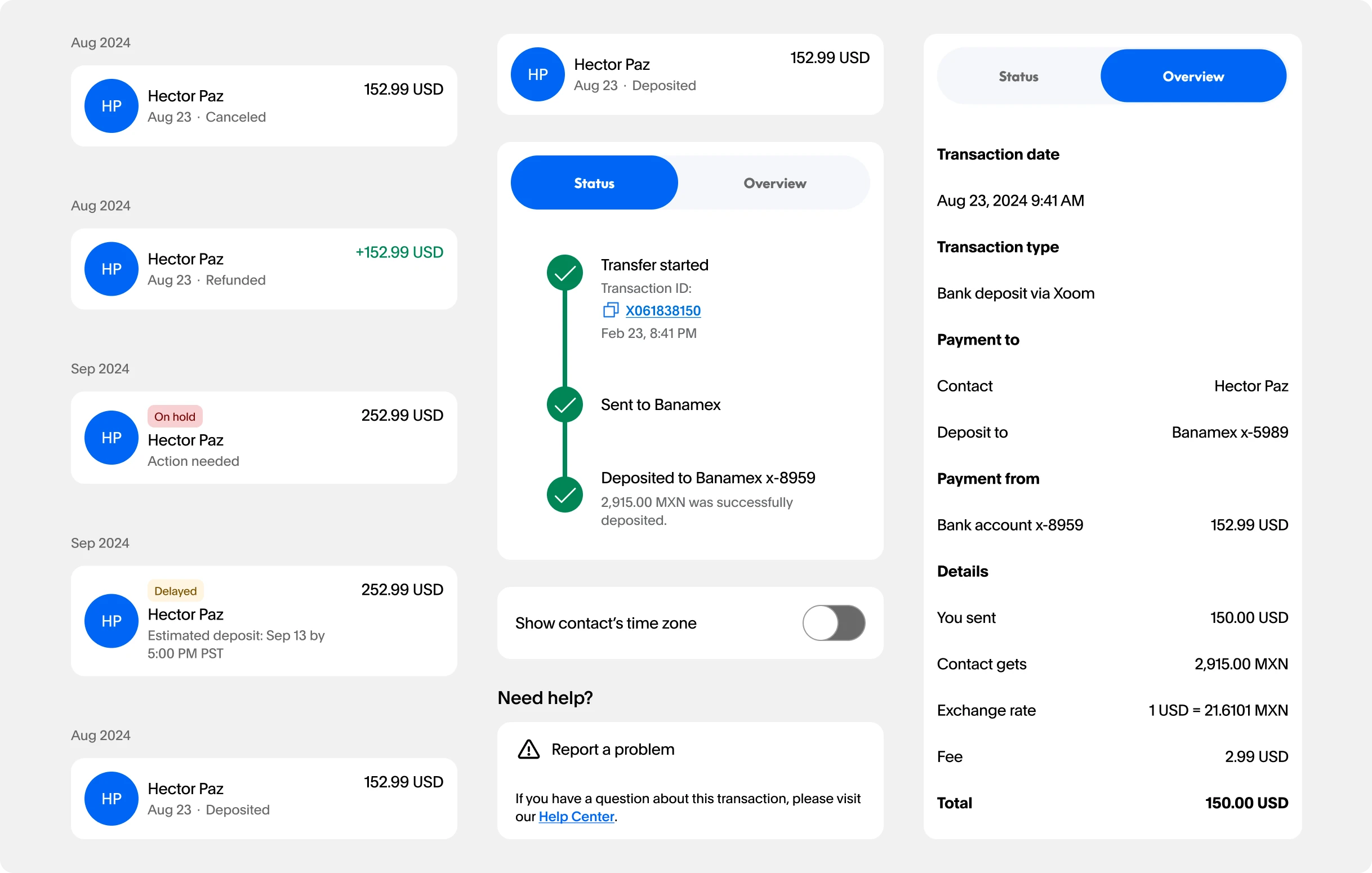
Activity & Tracking modules
Problem
No visibility. Xoom transactions didn’t appear in PayPal’s Activity history.
High support demand. Nearly half of monthly calls were about transfer status or
remediation.
Fragmented experience. Disconnected PayPal and Xoom systems made it hard for
users to track, act, or trust the process.
Goals
Give users real-time visibility into their Xoom transactions inside PayPal.
Reduce support call volume by making remediation actions accessible in-app.
Create a consistent, trustworthy experience across PayPal and Xoom, regardless
of platform or region.
Process
Research & Insights
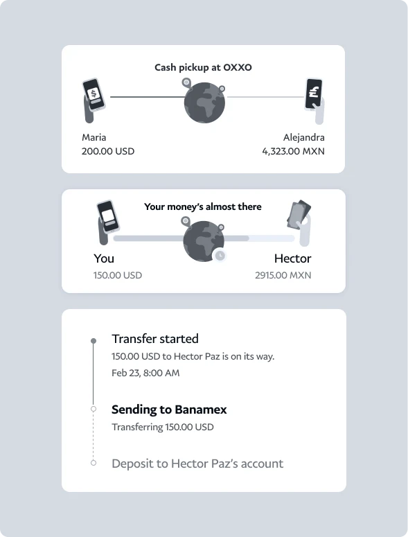
We began by studying other remittance services to understand how users expect to track transactions.
The takeaway was clear: when money is in motion, clarity beats decoration. Users
didn’t want
animations or flashy UI, they wanted accurate status updates and clear next steps.
Initially, I considered using celebratory animations to make the process feel lighter and bring
delight to the experien. Testing
showed that when urgency is high—like sending money to family—users valued straightforward
status
updates over visual flourishes. This shifted our design approach to focus on clean
layouts, high
information density, and strong hierarchy.
Initial explorationsComponents
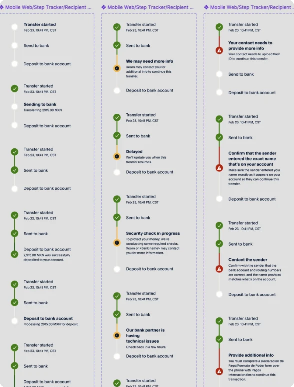
Exploration & Patterns
In early workshops, we explored layouts, motion concepts, and interaction patterns that could fit
both PayPal and Xoom’s design systems.
Ultimately, I stripped away anything that didn’t directly help users understand or act on their
transfer. I also accounted for different perspectives, sender and recipient, and
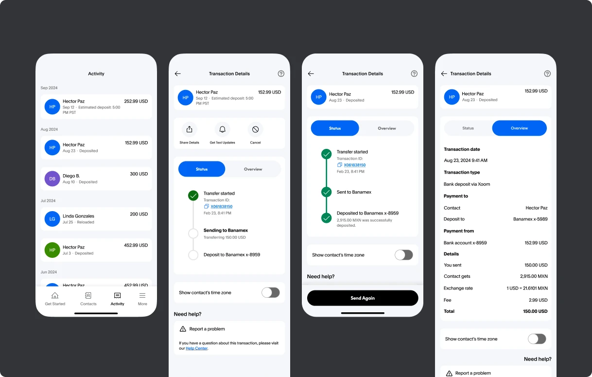
added a time zone
toggle to clarify delivery times. This small change significantly reduced confusion in testing.
Cross-functional collaboration was key: I worked closely with PMs, engineers, compliance, and the
Design Systems team to ensure the designs not only looked consistent but also worked within the
constraints of legacy tech stacks and multiple brand identities.
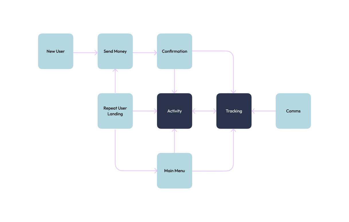
Entry points flow
Outcomes
+1.5%
customer retention
+21.5%
lift in “Send Again” engagement
+21.27%
increase in transaction completion
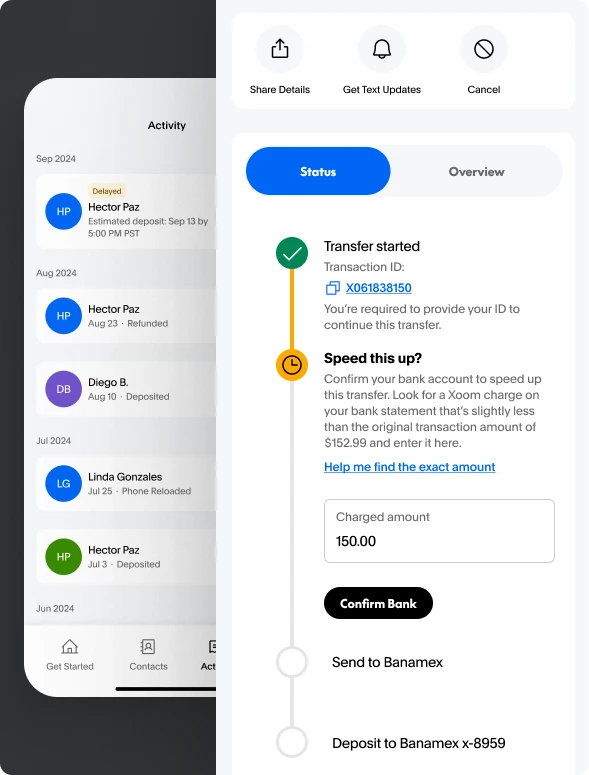
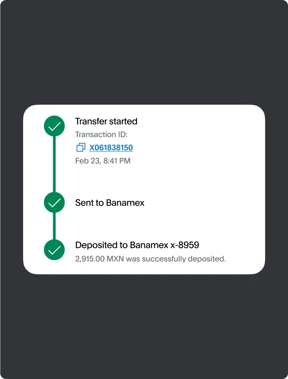
The new unified activity view launched inside PayPal, enabling users to:
Track Xoom transactions in real time.
Take remediation actions directly in-app.
Re-send previous transfers with one tap.
Delayed status
Completed statusTransfer statusTransaction details web